Hill Country Barbecue Market
Long-term brand development and creative direction for Hill Country Barbecue Market.
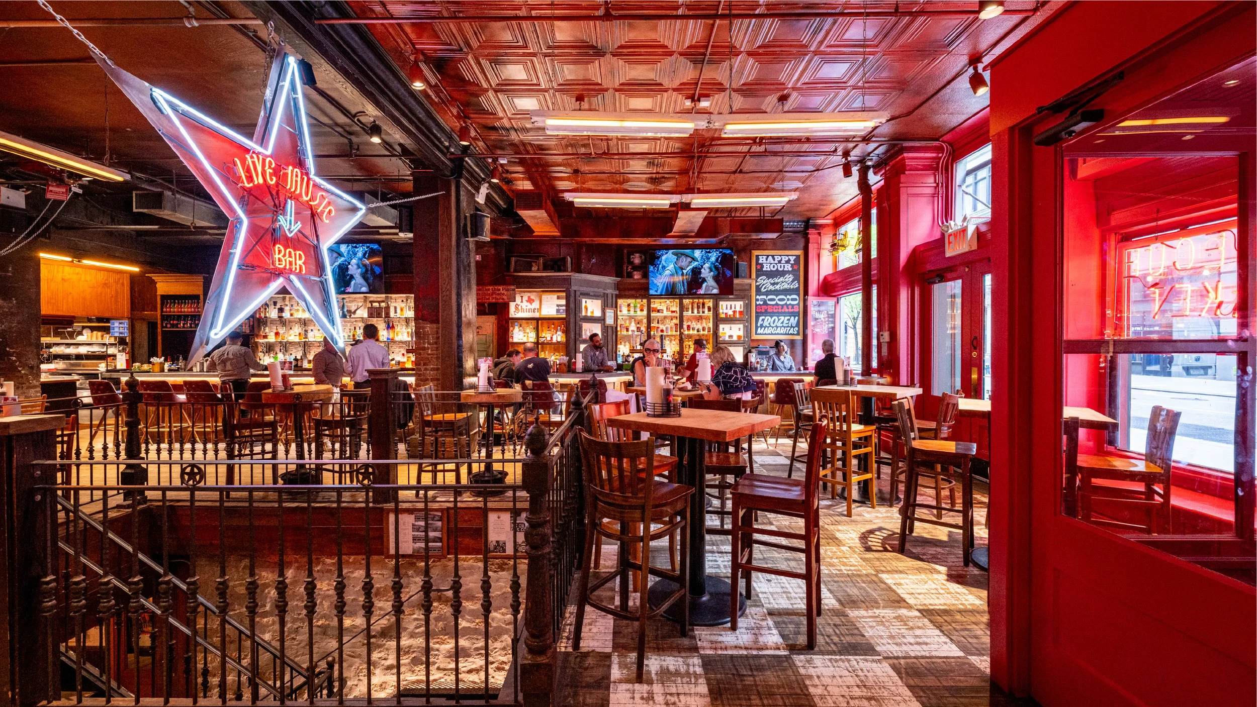
Hill Country Barbecue Market brought the traditions and communal energy of Central Texas barbecue into a distinctive hospitality experience. The brand needed to feel authentic to its roots while working as a contemporary restaurant destination with a recognizable voice of its own.
Over an extended relationship, the work shaped a cohesive expression across the restaurant experience. Bold typography, documentary-style photography, straightforward language and tactile materials connected the food, music, hospitality and sense of place without turning the brand into a Texas cliché.
Brand / Client
Hill Country Barbecue Market
Category
Hotels, Restaurants & Retail
Context
Long-term brand stewardship
Role
Brand strategy, creative direction, design direction and hands-on design
Services
Brand Development, Creative Direction, Design Direction, Campaign Development, Print Collateral, Menu Design, Signage, Digital Design, Photography Direction
Photography
Brian Klutch and Gabe Ramirez
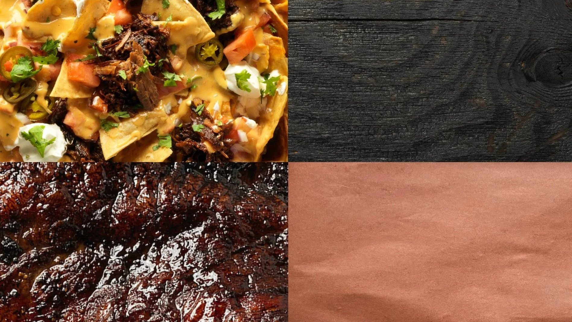
The brand system balanced Texas heritage with a direct, contemporary voice—flexible enough for a restaurant, music venue, catering business and growing family of experiences.
An ongoing program of events, collaborations and seasonal promotions kept the brand active without losing its core character.
Typography, photography and straightforward language made each communication distinct while remaining recognizably Hill Country.
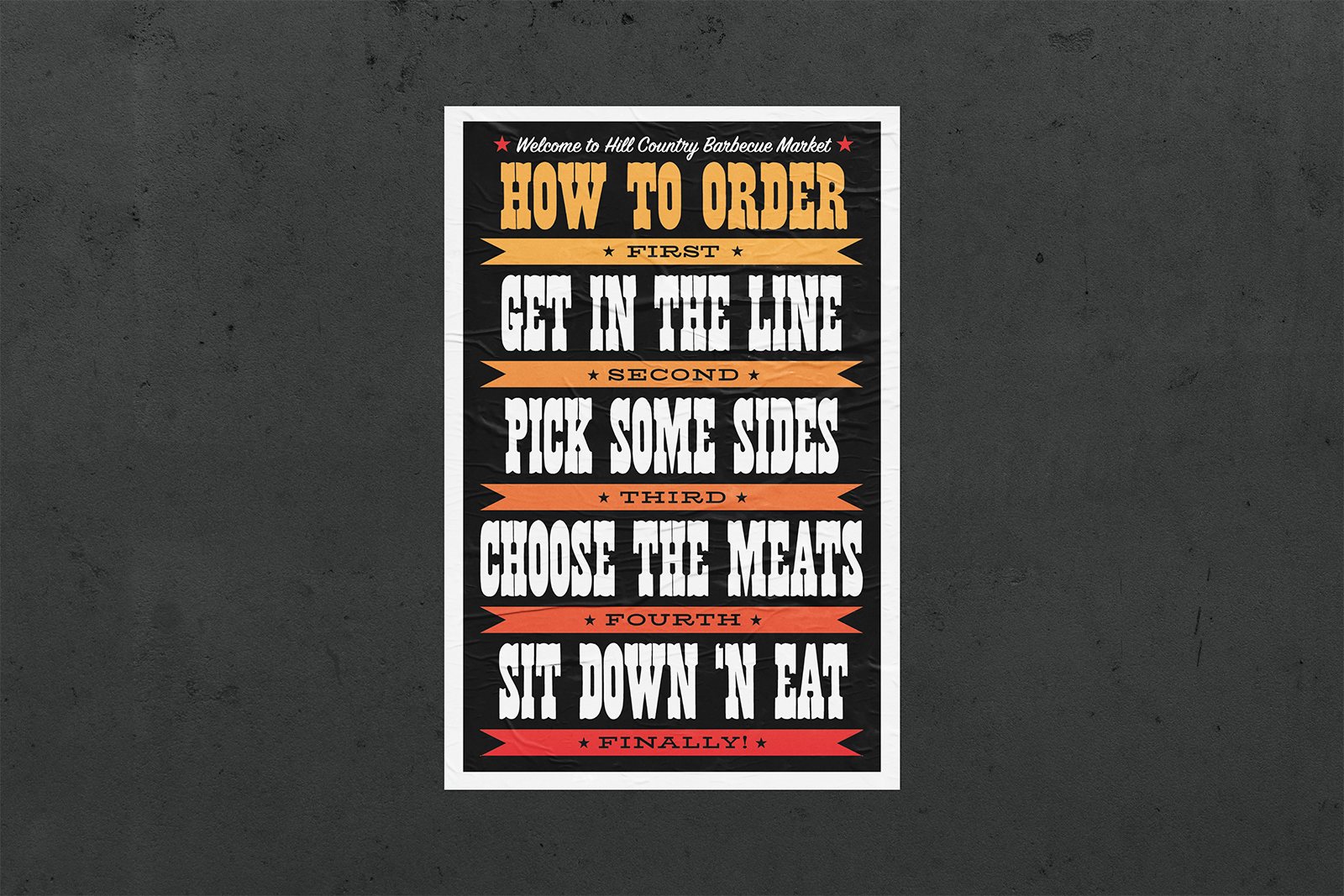
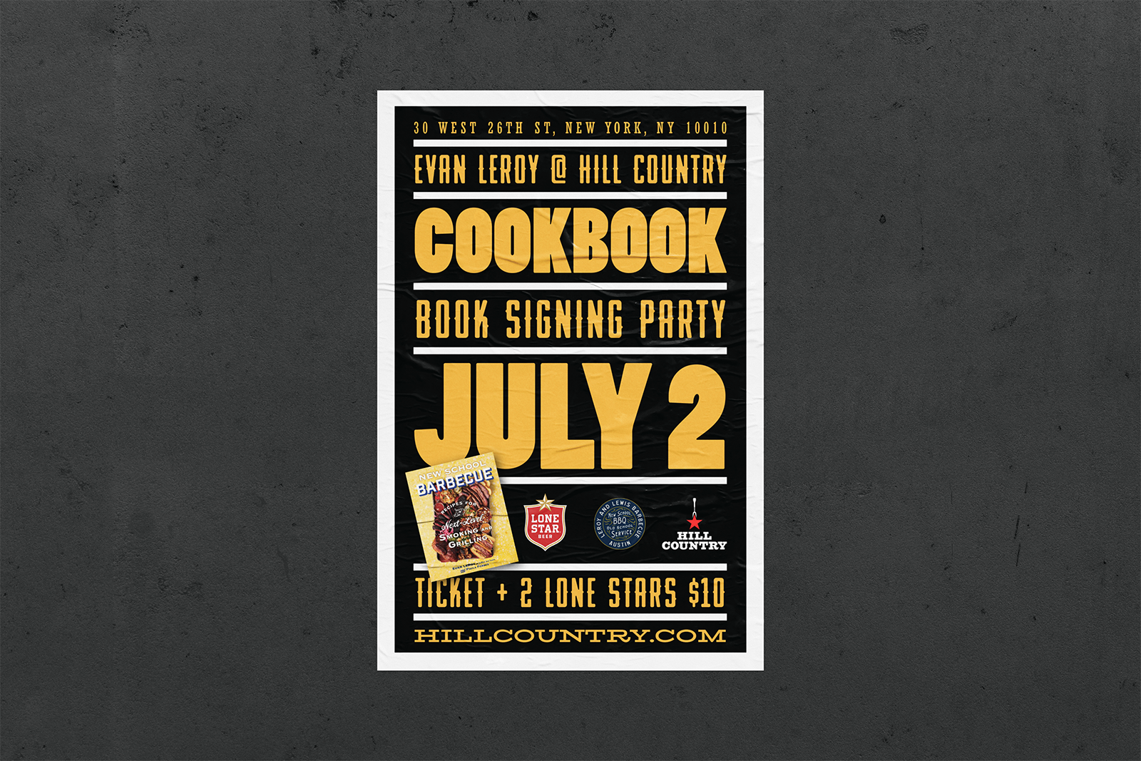
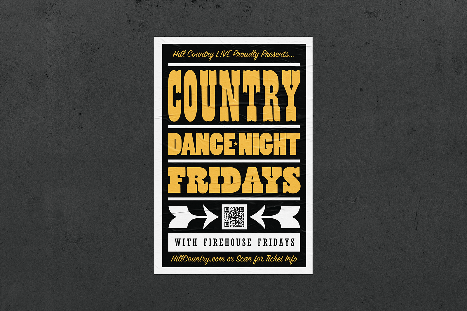
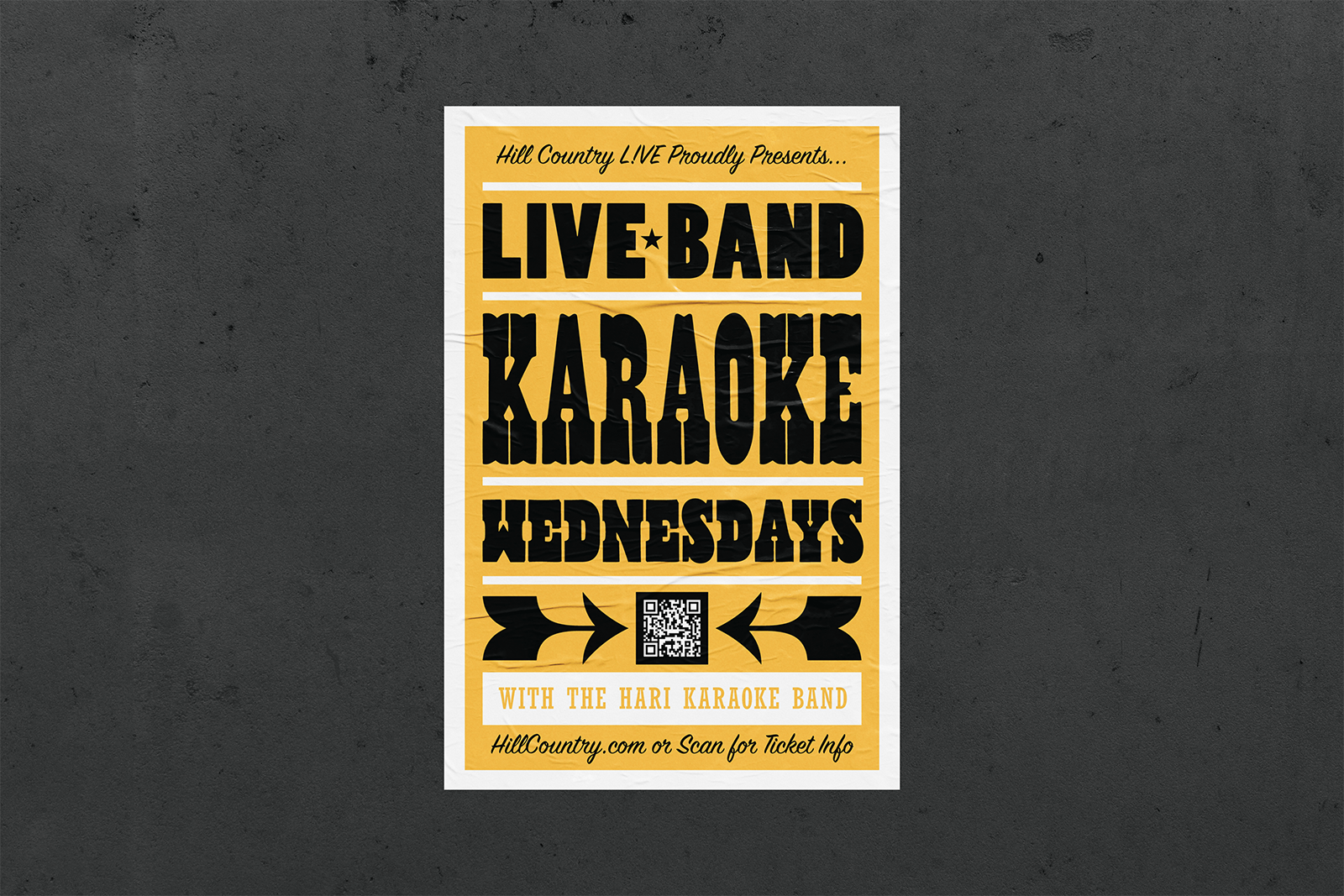
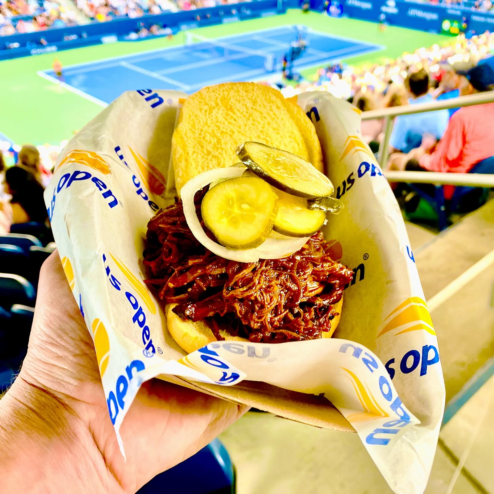
The system also needed to travel. For the US Open, Hill Country became a high-volume Food Village experience spanning menus, signage and service-area graphics.
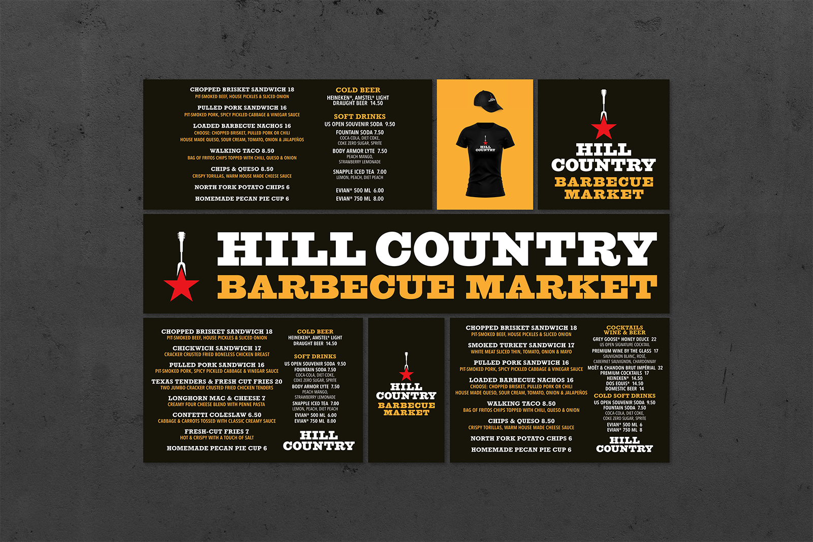
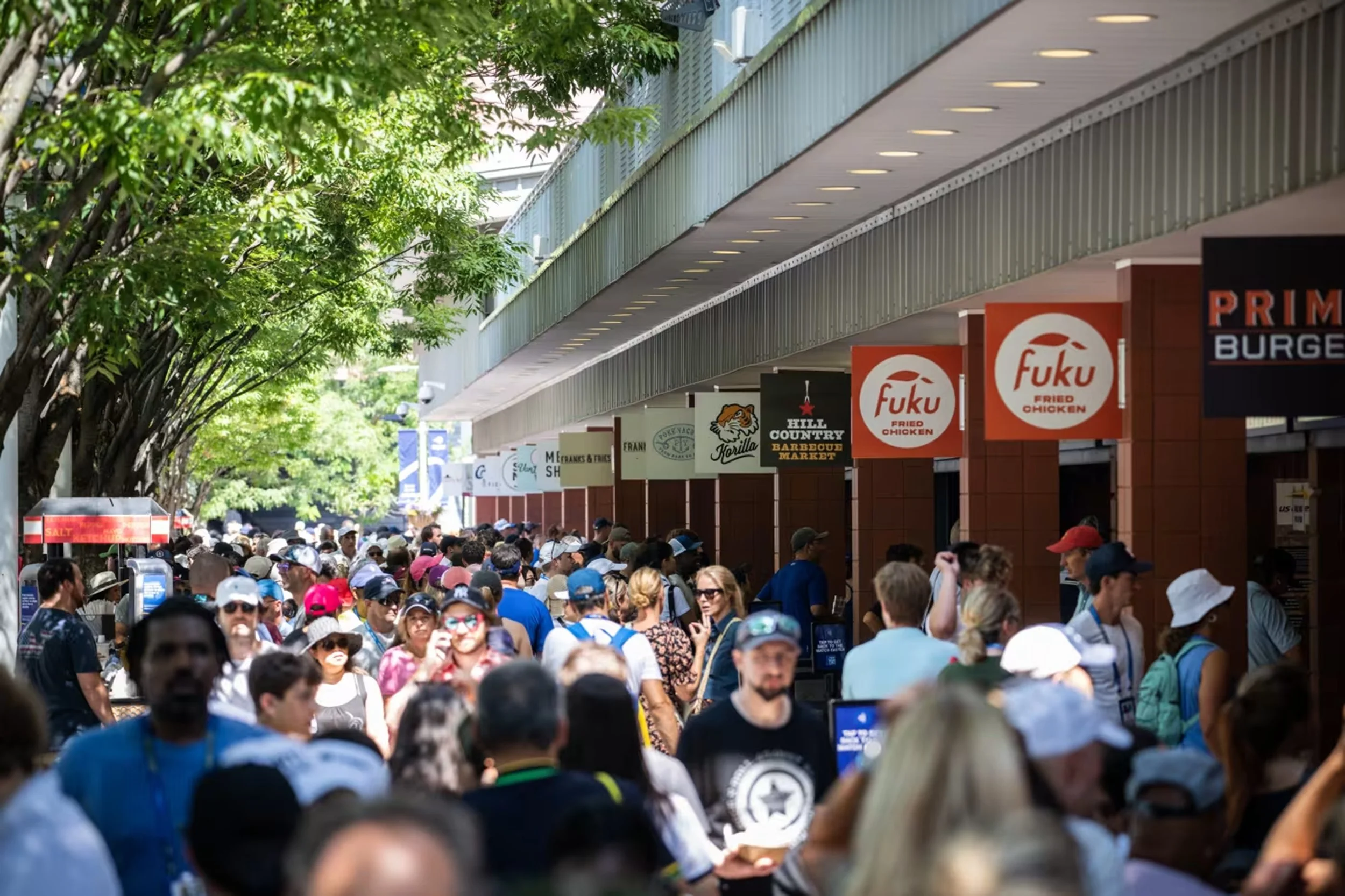
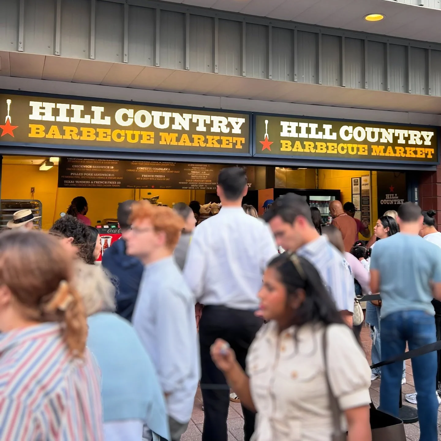
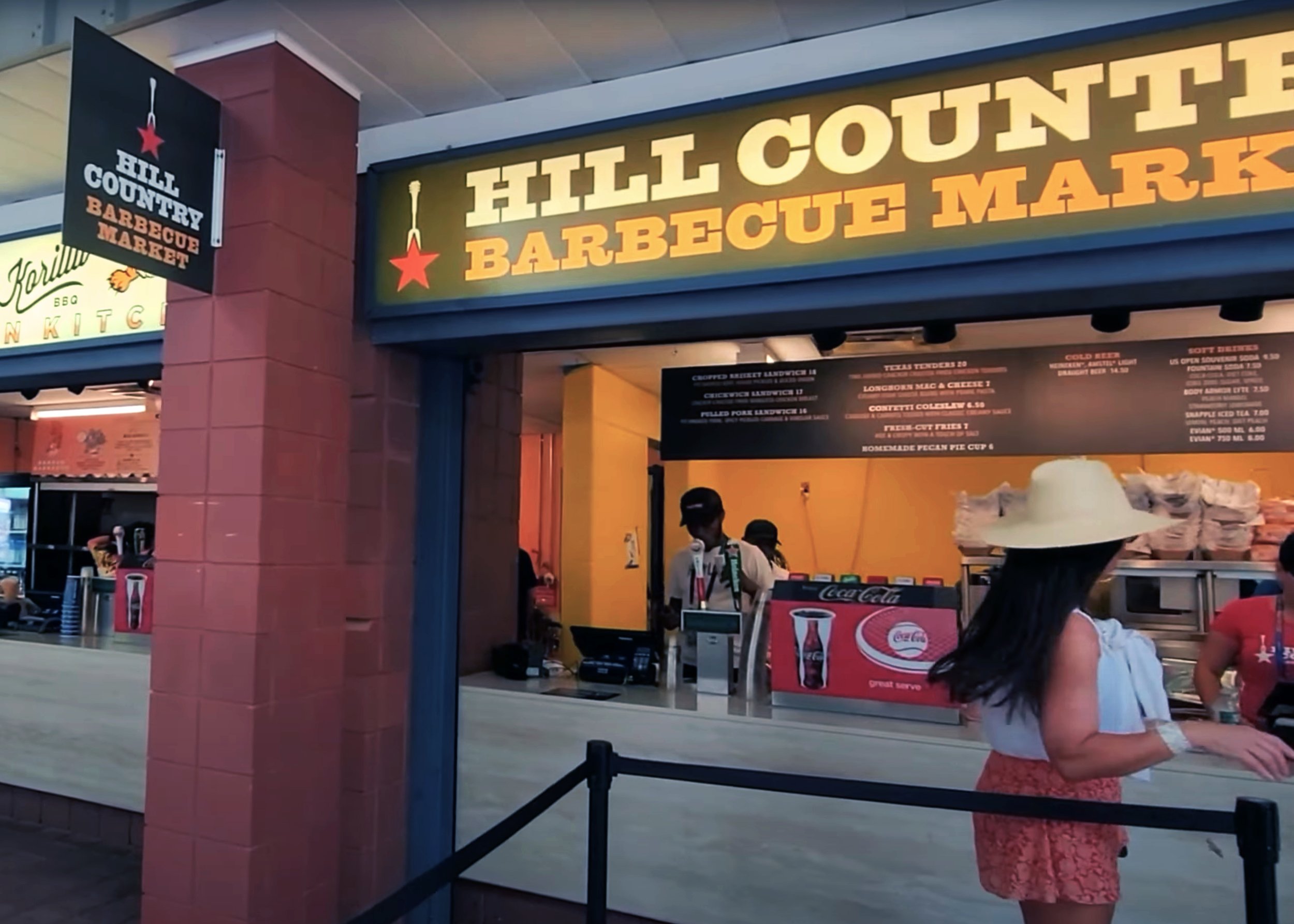
The system extended across brand development, campaigns, menus, signage, collateral, digital materials and ongoing guest-facing communications.
The result was a flexible brand language capable of supporting daily restaurant needs, special events and new initiatives while remaining unmistakably Hill Country.