Little Black Dress Wines
Rebrand, packaging system and digital campaign work.
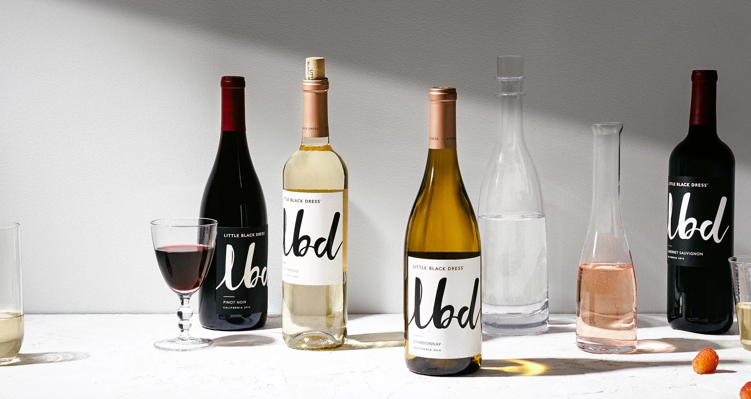
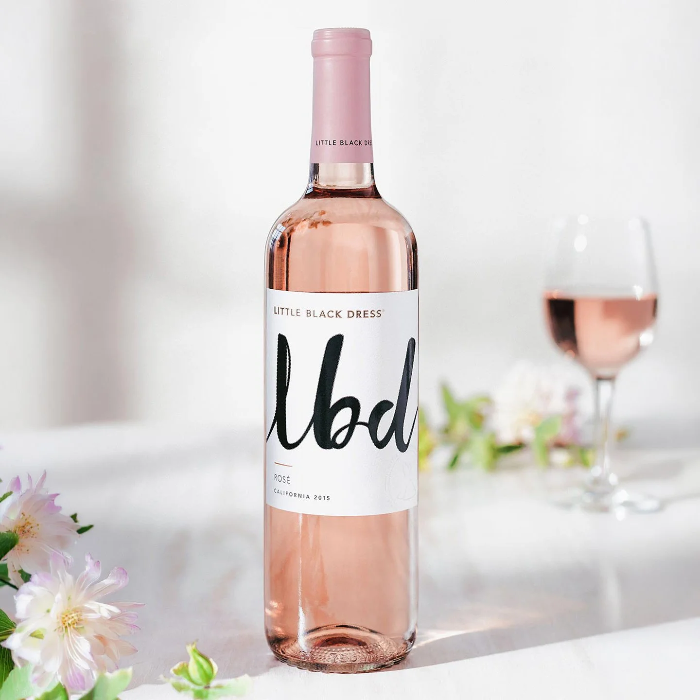
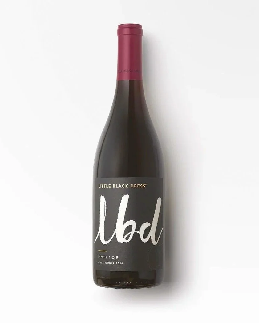
Little Black Dress had a strong name but a visual identity that did not match its potential. The rebrand moved the wine from cute and fragmented into a more sophisticated, modern and premium space. The strategy centered on Understated Elegance: confidence without shouting, fashion cues without becoming disposable and a visual system that could stand out at shelf while still feeling refined. The new identity leaned into the abbreviation LBD, creating a stronger mark, more premium packaging and a clearer connection to fashion.
Brand / Client
Little Black Dress Wines
Category
Packaged Goods, Wine & Spirits
Context
The O Group
Role
Strategy, creative direction and design direction
Services
Brand Strategy, Brand Identity, Packaging Design, Logo Design, Website Design, POS Design, Relaunch Video, Campaign Development
Collaborator
Clara Freeman, design
Development
Client-side internal team