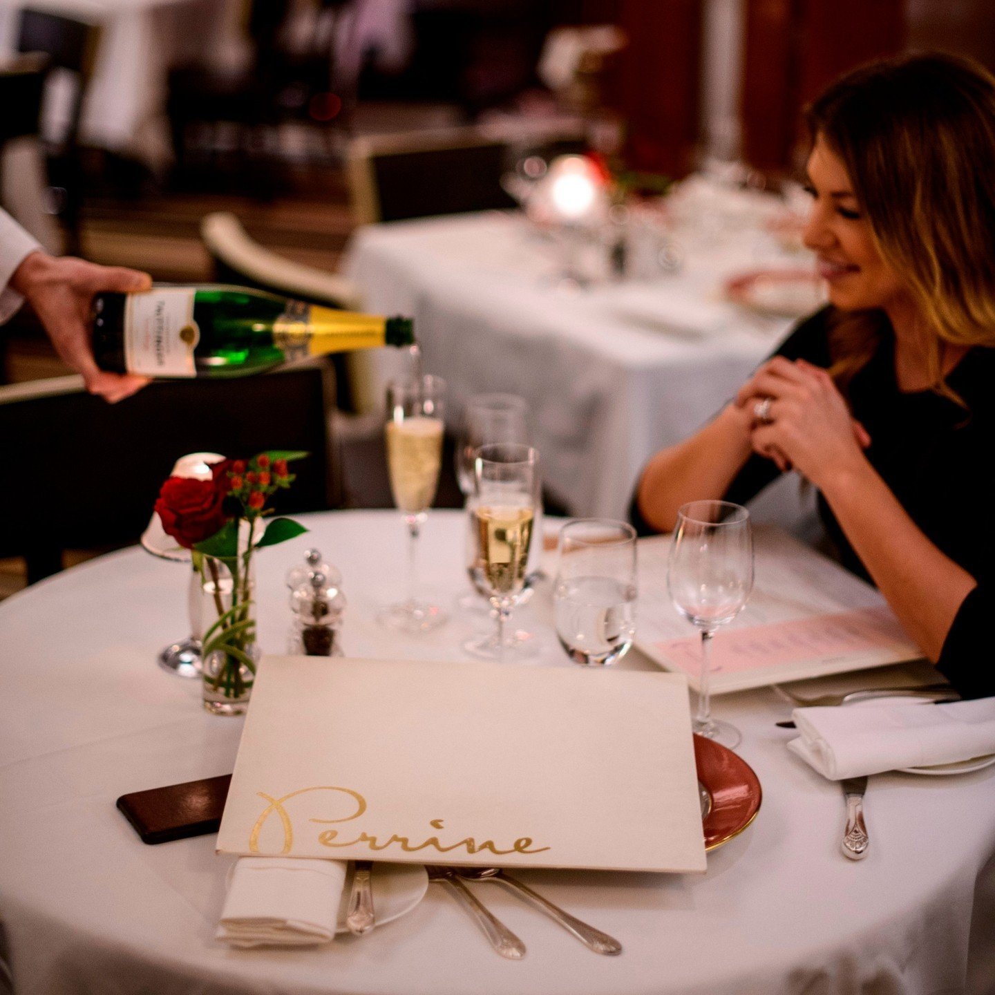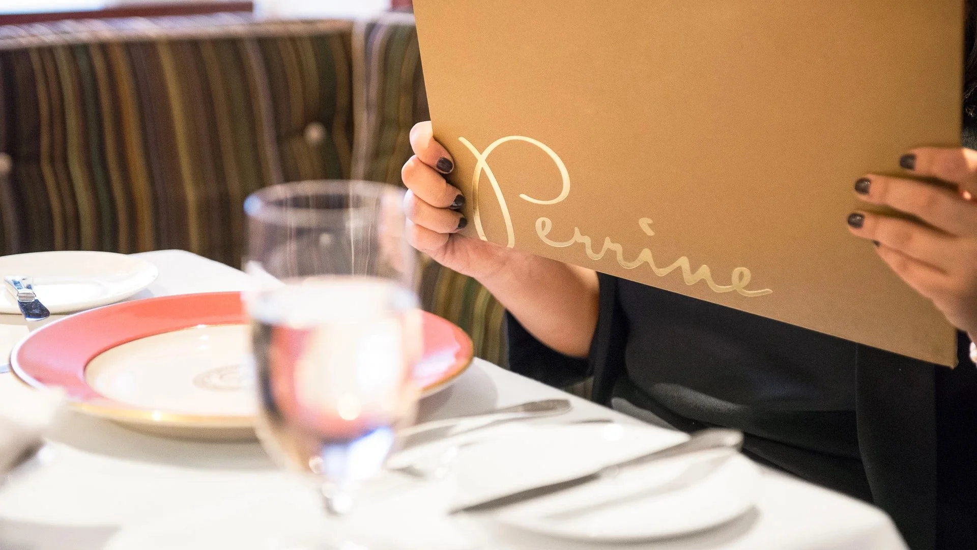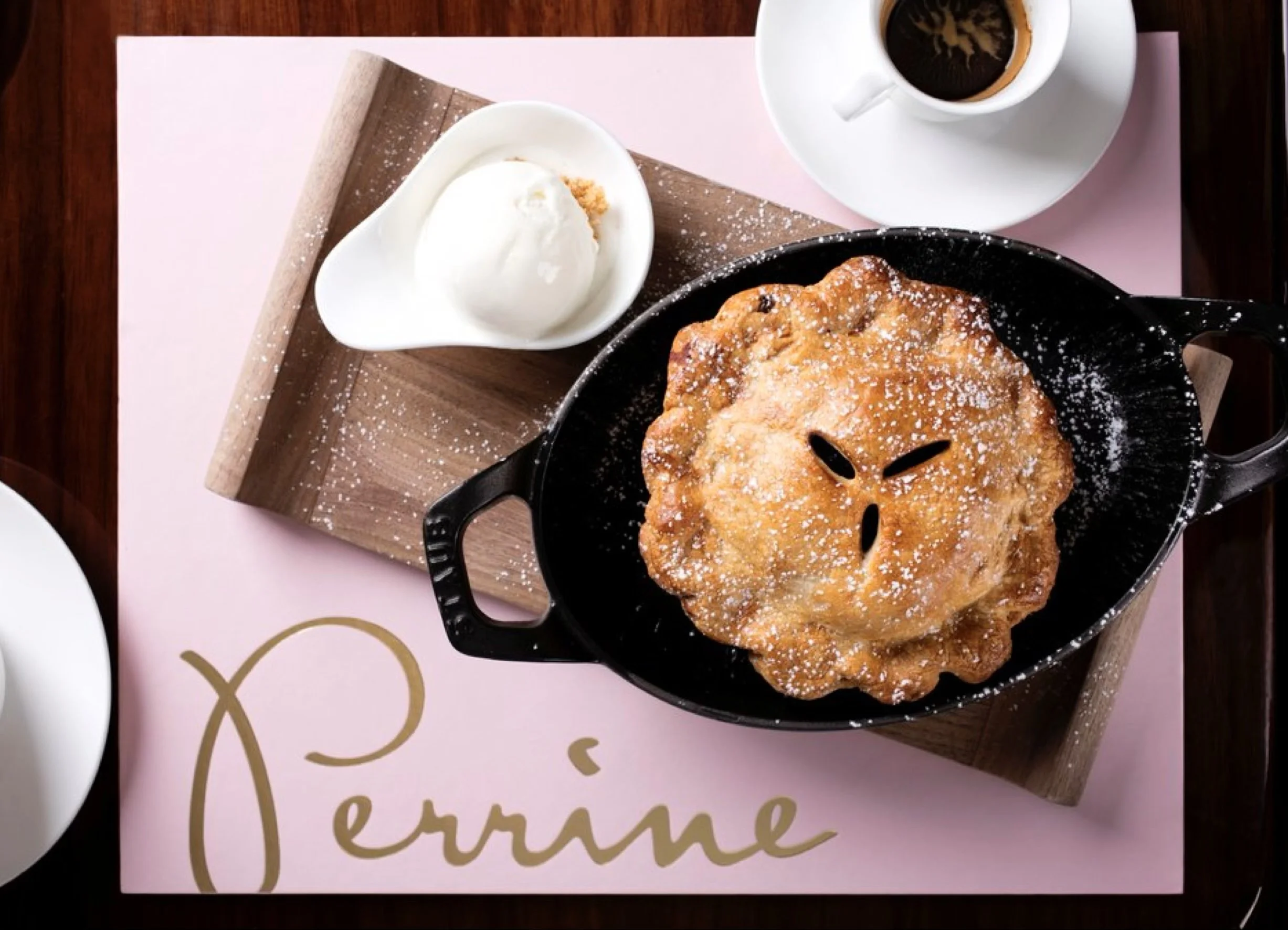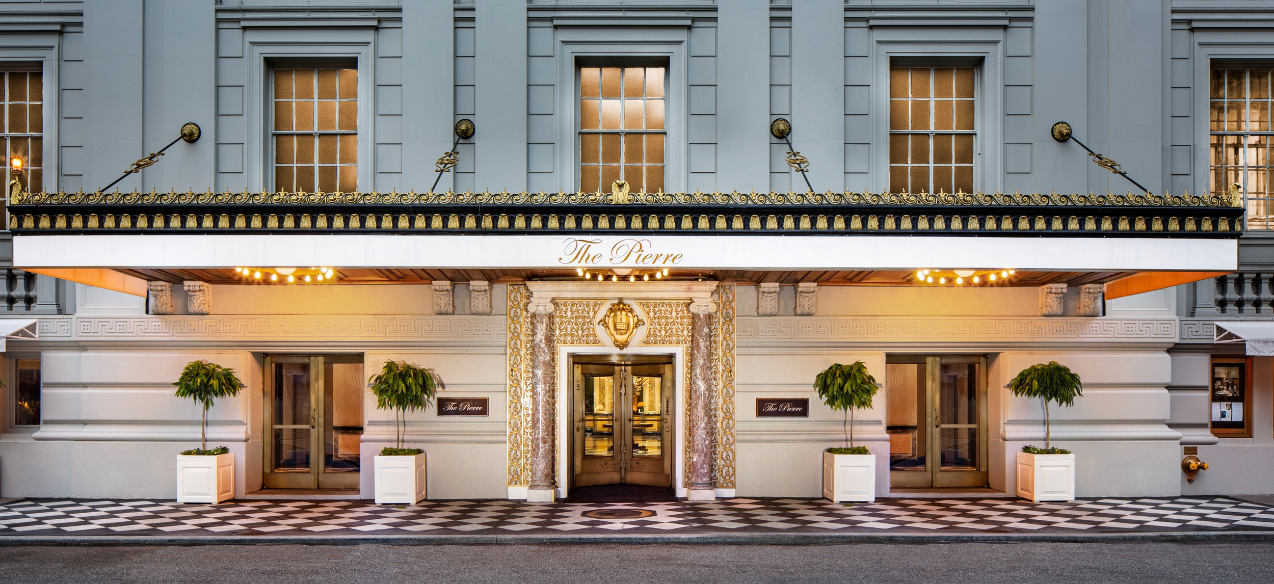
Naming and brand identity for Perrine at The Pierre, a Taj hotel in New York City.
perrine
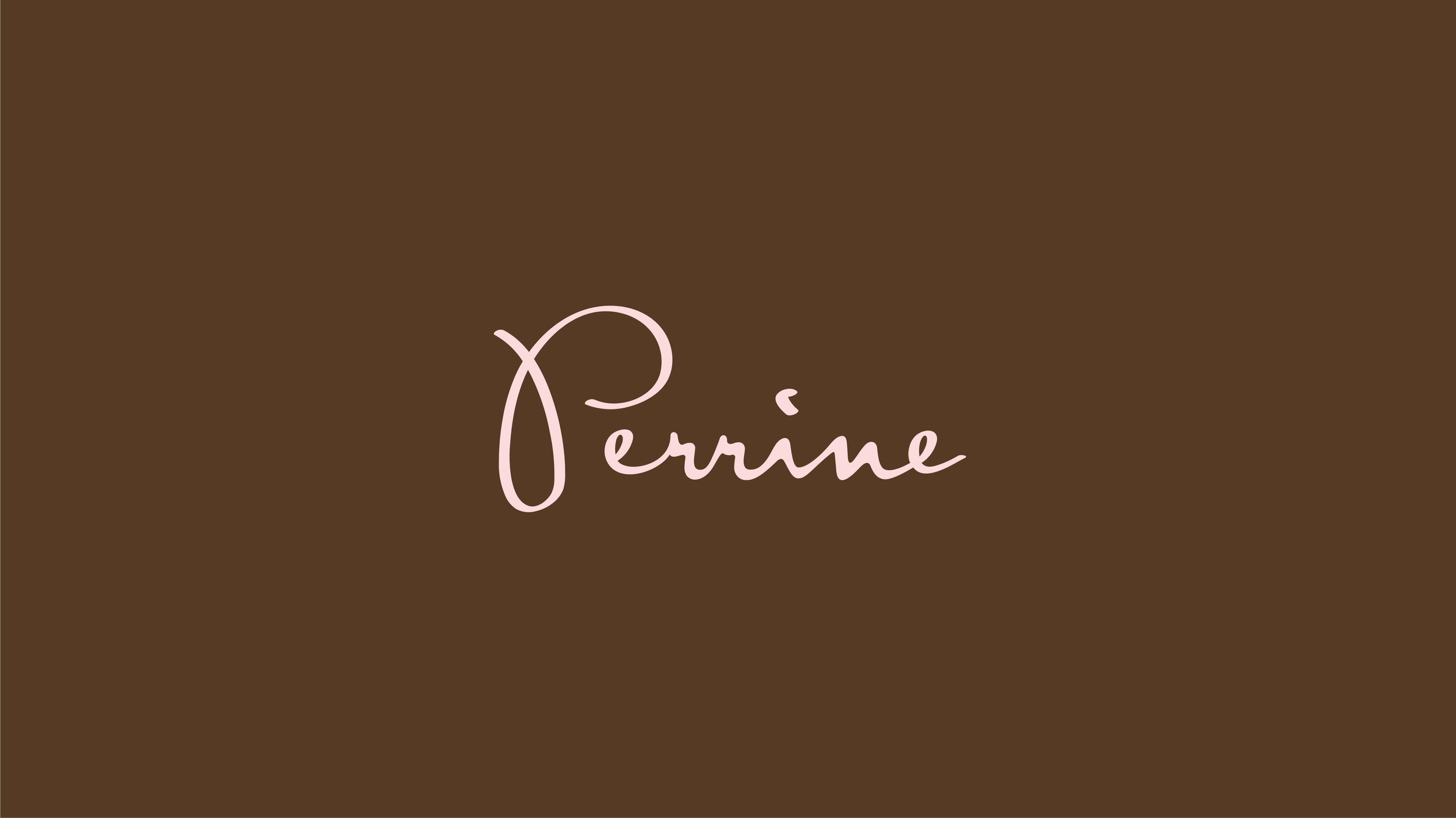
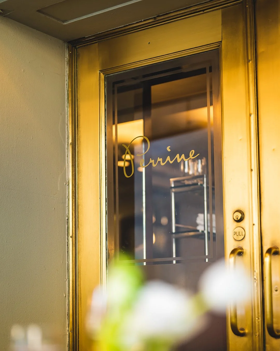
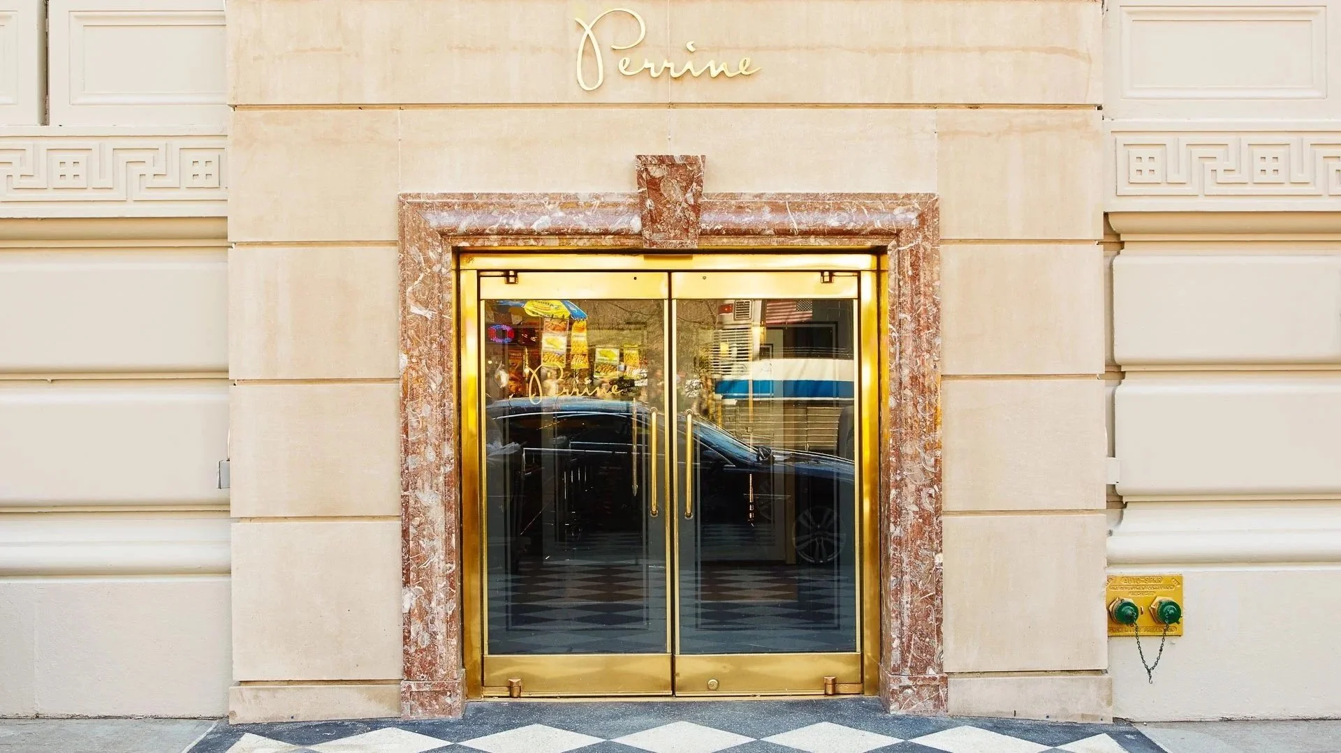
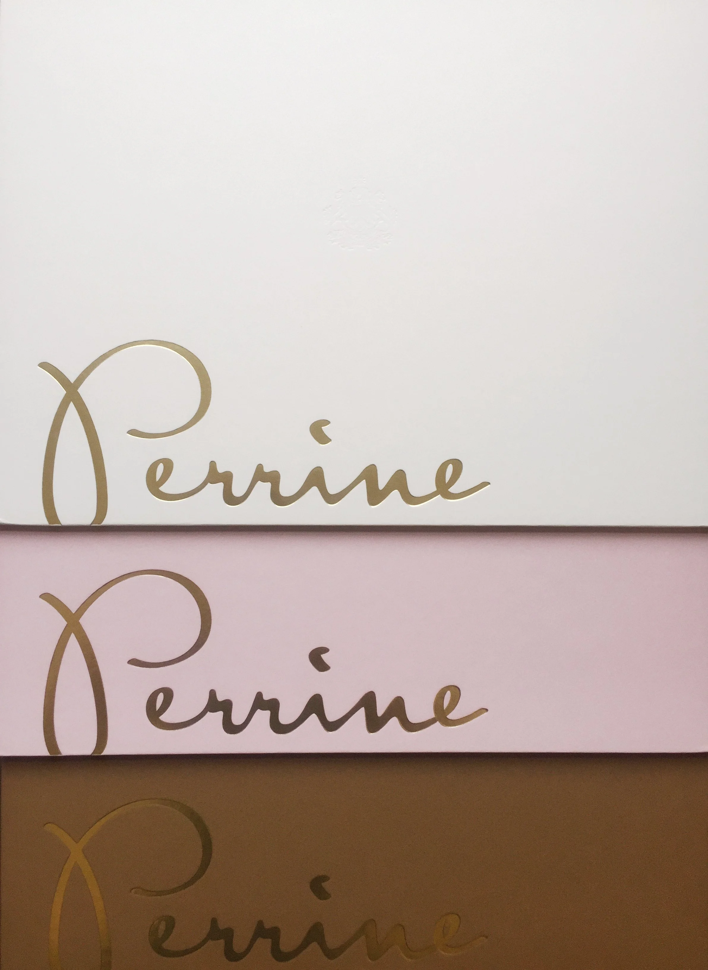
The restaurant needed a name and identity that could attract guests beyond the hotel and appeal to a discerning New York dining audience. The selected name, Perrine, worked because it was connected to Pierre while feeling feminine, confident and sophisticated on its own. The visual direction leaned into a handwritten signature, warm materials, refined color and decorative accents to give the restaurant a soft but polished identity. The final system extended into menus, launch materials, signage and guest-facing applications.
Brand / Client
Perrine / The Pierre
Category
Hotels, Restaurants & Retail
Context
The O Group
Role
Naming, creative direction and design direction
Services
Naming, Brand Identity, Creative Direction, Design Direction, Menu Design, Print Collateral, Launch Materials
Collaborator
Naomie Ross, design